Julia bar charts in the style of Edward Tufte
Introduction
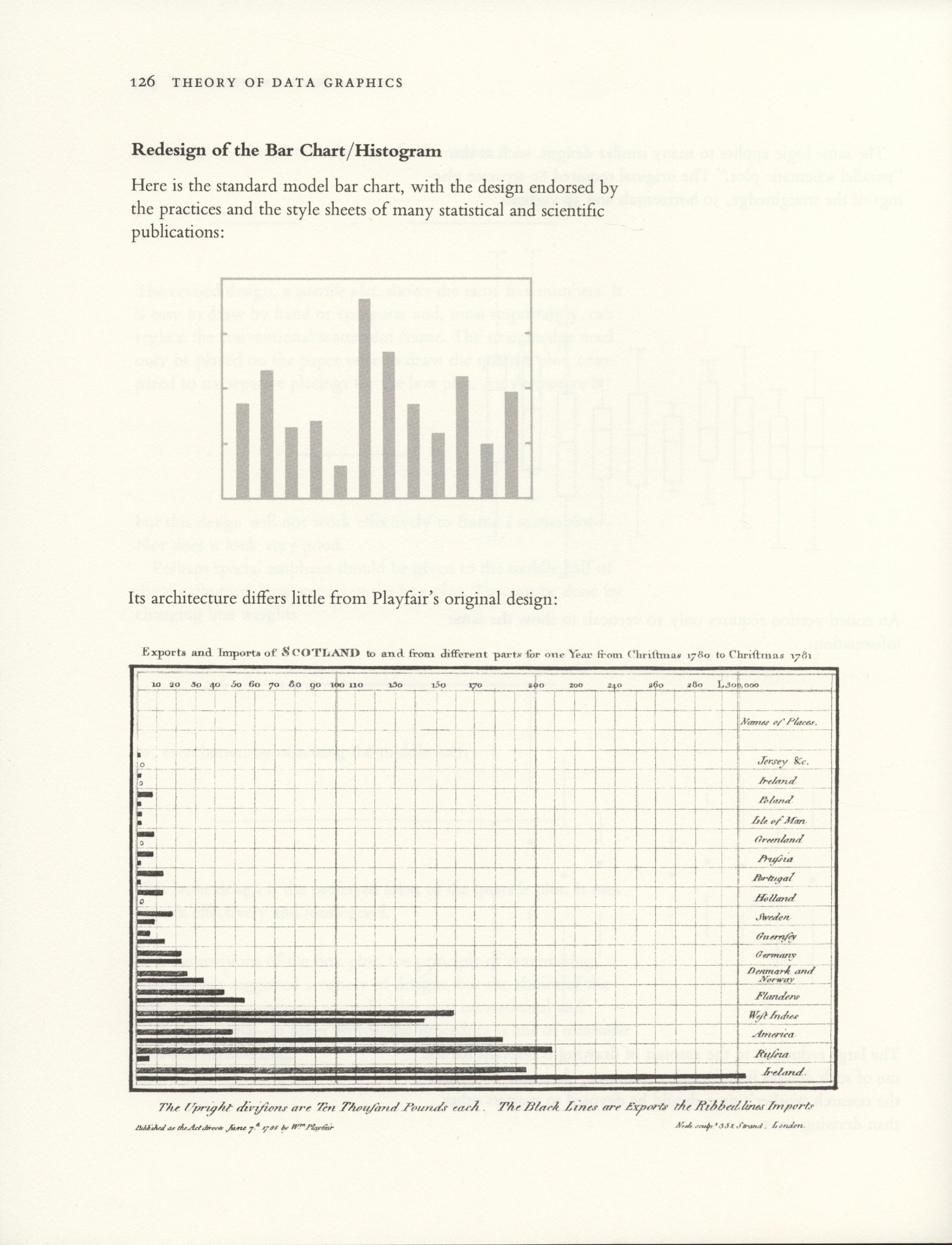
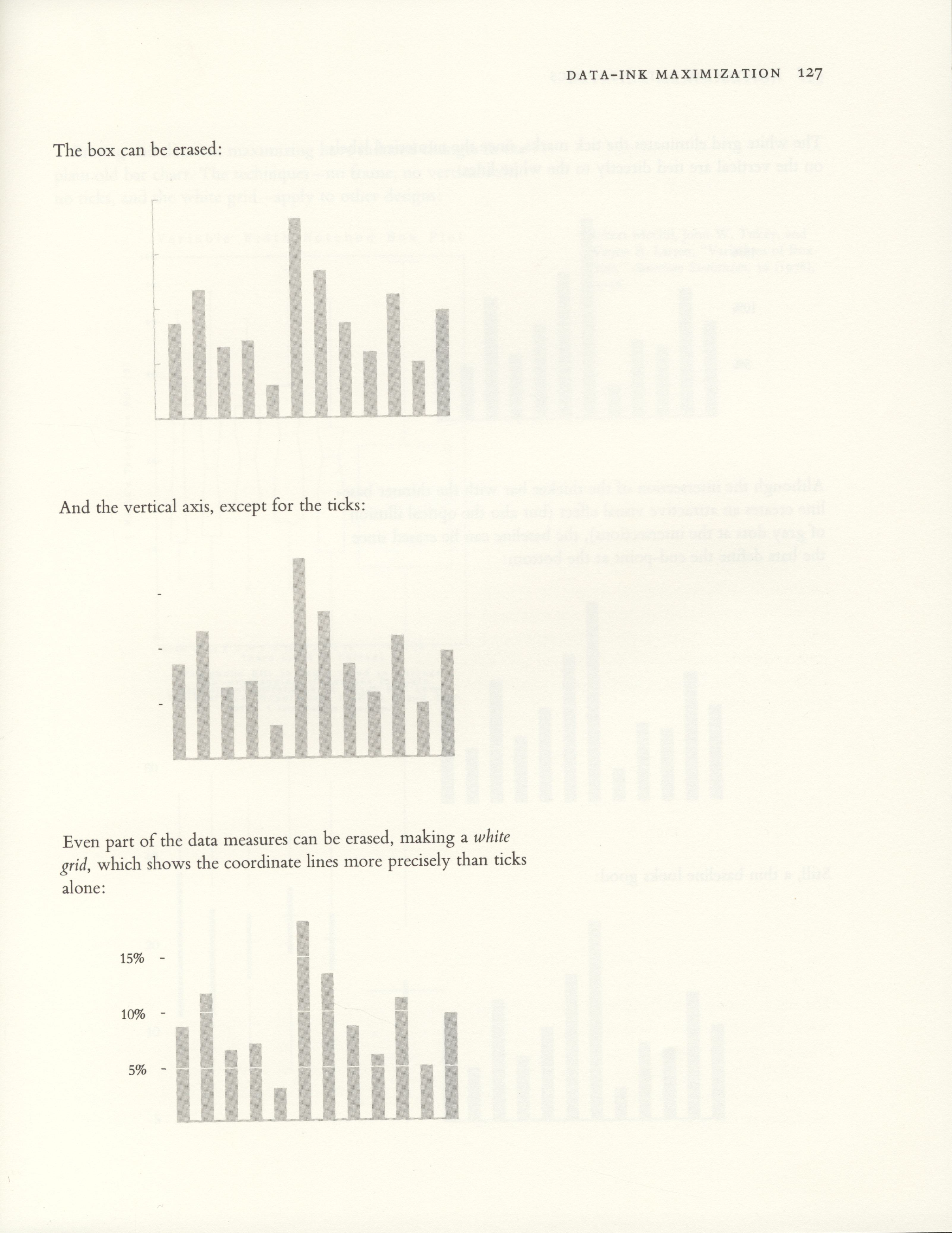
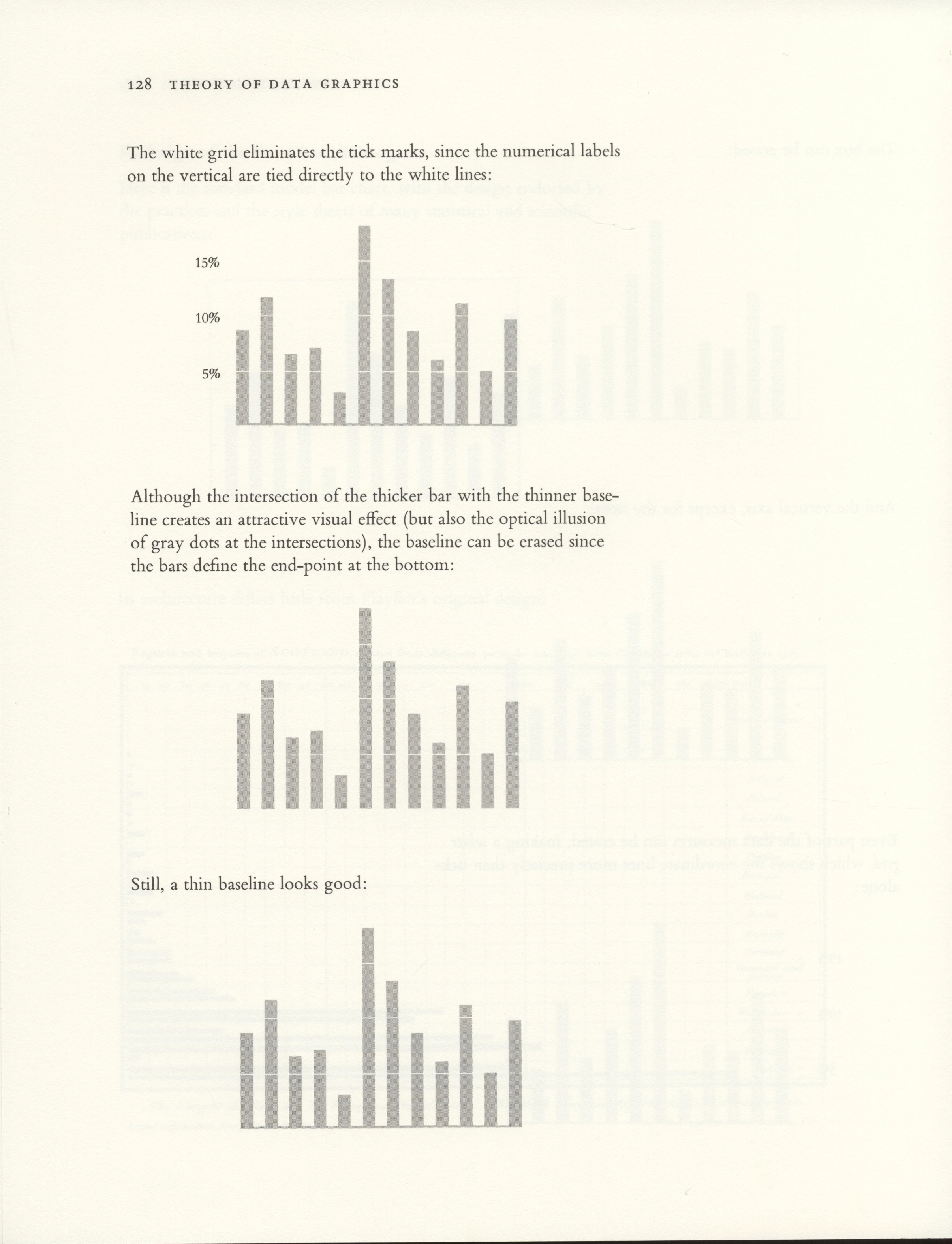
Edward Tufte’s famous book “The Visual Display of Quantitative Information” contains a section in which he redesigns the classic bar chart in a way that leaves exactly the ink necessary to convey the desired information. In this post, I’ll show how to replicate his visually-pleasing bar chart in Julia using the Gadfly graphing package.
Here’s what we’ll make.

For reference, Tufte’s redesign is shown below.
Bar charts in Julia using Gadfly
Gadfly is an awesome Julia package that I have been using recently to produce the majority of my scientific visualizations. It is based on Leland Wilkinson’s book The Grammar of Graphics and Hadley Wickhams’s ggplot2 for the R programming language. By default it produces some pretty nice bar charts, but also provides many opportunities for customization.
# Default

using Gadfly

function plot_default(title, data)
    p = plot(x=1:5, y=data,
        Geom.bar,
        Guide.title(title),
    )
    draw(SVG("default.svg", 9cm, 9cm), p)
end

plot_default("Rate the T.A.'s overall teaching effectiveness", [0, 1, 1, 7, 6])
Customizing Gadfly using Themes
Gadfly allows customization of a number of its components using Theme objects. We’ll define a Theme that modifies the bar color, background color, spacing between bars, and typefaces, and also eliminates the plot’s grid lines. More about customization using Themes can be found in the Gadfly Theme Documentation.
# Add Theme

using Gadfly

tufte_bar = Theme(
    default_color=colorant"lightgray",
    background_color=colorant"white",
    bar_spacing=25pt,
    grid_line_width=0pt,
    minor_label_font="Gill Sans",
    major_label_font="Gill Sans", # could be changed to Bembo if you prefer Tufte's serif typeface
)

function plot_theme(title, data)
    p = plot(x=1:5, y=data,
        Geom.bar,
        Guide.title(title),
        tufte_bar
    )
    draw(SVG("theme.svg", 9cm, 9cm), p)
end

plot_theme("Rate the T.A.'s overall teaching effectiveness", [0, 1, 1, 7, 6])
Customizing axes using Guides
Using Themes got us a lot of the way there, but our bar chart is still cluttered by a lot of unnecessary axis elements. We now use Gadfly’s Guides and Coords to remove some of the default axis elements. Here is the Gadfly Guides Documentation and the Gadfly Coords Documentation.
# Customize Guides

using Gadfly

tufte_bar = Theme(
    default_color=colorant"lightgray",
    background_color=colorant"white",
    bar_spacing=25pt,
    grid_line_width=0pt,
    minor_label_font="Gill Sans",
    major_label_font="Gill Sans", # could be changed to Bembo if you prefer Tufte's serif typeface
)

function plot_guides(title, data)
    p = plot(x=1:5, y=data,
        Geom.bar,
        Guide.title(title),
        Guide.xlabel(""),
        Guide.ylabel(""),
        Guide.xticks(ticks=collect(1:5)),
        Guide.yticks(ticks=nothing),
        Coord.cartesian(xmin=0, xmax=6, ymin=0, ymax=10),
        tufte_bar
    )
    draw(SVG("guides.svg", 9cm, 9cm), p)
end

plot_guides("Rate the T.A.'s overall teaching effectiveness", [0, 1, 1, 7, 6])
Adding a baseline and grid lines using annotations
Finally, we would like to include the baseline and grid lines from Tufte’s bar chart. To do this, we will use Guide.annotation to place annotations consisting of a Compose graphic. Compose is a vector graphics system for Julia, that forms the basis of Gadfly. Guide.annotation can be used to place arbitrary Compose elements into Gadfly plots. Here is the Compose Package Documentation along with the Guide.annotation Documentation.
# Add Annotations

using Gadfly
using Compose

tufte_bar = Theme(
    default_color=colorant"lightgray",
    background_color=colorant"white",
    bar_spacing=25pt,
    grid_line_width=0pt,
    minor_label_font="Gill Sans",
    major_label_font="Gill Sans", # could be changed to Bembo if you prefer Tufte's serif typeface
)

tick_width = 1pt
baseline = compose(context(), line([(0.5, 0), (5.5, 0)]), fill(nothing), stroke(colorant"lightgray"), linewidth(2pt))
line1 = compose(context(), line([(0, 2), (6, 2)]), fill(nothing), stroke(colorant"white"), linewidth(tick_width))
line2 = compose(context(), line([(0, 4), (6, 4)]), fill(nothing), stroke(colorant"white"), linewidth(tick_width))
line3 = compose(context(), line([(0, 6), (6, 6)]), fill(nothing), stroke(colorant"white"), linewidth(tick_width))
line4 = compose(context(), line([(0, 8), (6, 8)]), fill(nothing), stroke(colorant"white"), linewidth(tick_width))

function plot_annotations(title, data)
    p = plot(x=1:5, y=data,
        Geom.bar,
        Guide.title(title),
        Guide.xlabel(""),
        Guide.ylabel(""),
        Guide.xticks(ticks=collect(1:5)),
        Guide.yticks(ticks=nothing),
        Coord.cartesian(xmin=0, xmax=6, ymin=0, ymax=10),
        Guide.annotation(baseline),
        Guide.annotation(line1),
        Guide.annotation(line2),
        Guide.annotation(line3),
        Guide.annotation(line4),
        tufte_bar
    )
    draw(SVG("annotations.svg", 9cm, 9cm), p)
end

plot_annotations("Rate the T.A.'s overall teaching effectiveness", [0, 1, 1, 7, 6])
There we go!
Visualizing my TA ratings
We can now use what we created to visualize a data set. Here are the student ratings of my teaching as a TA for EE 120: Signals and Systems at UC Berkeley in the Fall 2015 semester.


